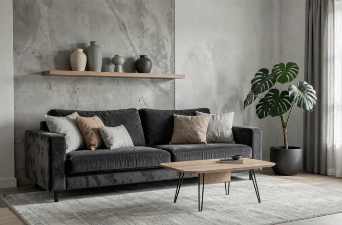
A dark gray sofa placed on a light oak floor, raw linen cushions, and a lime-rendered wall: this is the starting point of a gray interior that doesn’t resemble a dated catalog. The color gray remains a safe bet in decoration, but its use has profoundly evolved.
When used alone on all walls, it creates a flat, sometimes cold effect. Combined with natural textures and warmer accents, it becomes a subtle backdrop that highlights everything else.
Gray and natural textures: the foundation of a modern interior
We’ve all seen those interiors where gray covers walls, floors, and furniture in a uniform block. This total gray look, sometimes referred to as “millennial gray,” has marked the last decade, but it feels outdated. The problem isn’t the color itself; it’s the lack of relief.
The solution can be summed up in one word: layering materials rather than shades of gray. A pearl gray wall finished with lime render (limewash) does not produce the same effect as a satin paint in the same shade. The render captures light unevenly and creates a depth that standard paint does not provide.
Add to this a warm wooden floor, natural oak or walnut, and gray immediately loses its coldness. You can explore Bricotage’s gray decor ideas to see how these combinations work room by room. The principle remains the same everywhere: gray serves as a neutral background, while natural materials bring warmth.
- Linen, boucle wool, washed cotton for textiles (cushions, curtains, throws)
- Natural stone or sandstone for a countertop or coffee table top
- Raw or brushed wood for furniture, shelves, or frames
- Rattan or wicker for an accent chair or pendants
Accent colors on gray walls: which combinations work in decor
Gray works best when it serves as a backdrop for bolder accents. There’s no need to overdo it: one or two strong elements are enough to transform a room.
Terracotta and anthracite gray in the living room
This is one of the most stable combinations right now. A dark gray wall (anthracite or graphite) with cushions, a vase, or a rug in terracotta tones creates a warm contrast effortlessly. Terracotta warms gray better than mustard yellow, which can appear garish depending on the lighting.
Olive and light gray in the bedroom
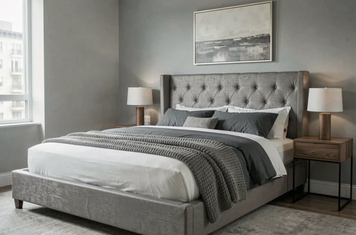
For a soothing bedroom, light gray paired with olive green works as a natural duo. We’re talking about a matte green, not a bright green. Olive green bedding on a pearl gray wall creates a soft ambiance without falling into blandness. Feedback varies on this point depending on the room’s exposure: a north-facing bedroom benefits from a slightly warmer green.
Deep blue as an accent touch
A dense, almost midnight blue in curtains or an accent chair adds character to a medium gray living room. The idea is to limit the blue to a single strong element to avoid a too systematic two-tone effect.
Gray in the kitchen and bathroom: the rooms where it works best
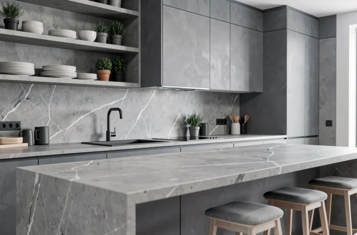
We often think of the living room when discussing gray decor, but it’s in technical spaces that gray truly makes sense. In the kitchen, a gray sandstone countertop paired with light wood cabinetry creates a balance between functional and warm.
Matte finishes age better than glossy finishes on gray. A satin gray paint on a kitchen cabinet shows fingerprints within weeks. A matte or velvet finish stays visually clean longer.
In the bathroom, large-format gray tiles (like polished concrete or porcelain stoneware) provide a contemporary look. Paired with brushed brass or matte black fixtures and a wooden vanity, you achieve a space that doesn’t resemble a cold showroom.
Avoiding the “all gray” effect: concrete mistakes to know
The classic trap is stacking grays without breaks. Gray walls, gray sofa, gray rug, gray curtains: even with varying shades, the overall effect ends up lacking life. Three gray surfaces maximum per room is a good limit to keep in mind.
Another common mistake: ignoring the temperature of light. A bluish gray under cold LED lighting turns into steel blue. Under warm light, it becomes softer. Before choosing a shade, always test a sample in the relevant room, both during the day and in the evening.
- Test the shade on at least one square meter, not on a color swatch of a few centimeters
- Observe the effect under natural light and artificial lighting
- Systematically pair at least one warm material (wood, leather, brass) with each gray piece
Gray is not a lazy color if treated as a background, not as a complete decor. A successful gray interior relies on the materials and accents that surround it, not on the shade itself. The choice of furniture, textiles, and lighting matters more than the paint color chart. It’s by balancing material and color breaks that you achieve a space that ages well, far from the monotony of the total gray look.